Kim Chan Hee 0334532
Bachelor of Design (Honors) in Creative Media.
Final Project Advanced Typography.
Lecture Notes.
Instructions.
Final Project.
For our project two, we were to think of an idea to either create our own font or explore the use of typefaces on my area of interest. Where I think of two ideas which are, to create a design of grocery bag, wherein my own experience people still tend to use plastic bags instead of grocery bags which using plastic bags to increase pollutions in the sea and become a danger to marine life. So, designing a nice design using typography may increase the interest of the consumers to use grocery bags to do groceries and may increase awareness of why we must not use a plastic bag and recycle using grocery bags. Second idea was to improve the design of a movie ticket , but Mr.Vinod and Mr.shamsul told me that I should think about the limitations of the design the machine can print and most of the people nowadays buy online so, it might not be that effective so I decided to go with my first idea to improve designs of a grocery bags.
 |
| "Inspiration" fig 1.1 |
I have search for some good examples for inspiration and found some good examples like the one shown above, which is a grocery bag used in the mart to encourage people to use less plastic bags.
This is the process of me making the design using Adobe Illustrator.
This is my first design where I make the hands making a heart around the earth like it is hugging it and loving it with love and the heart shaped hands are to also look like an arrow in the recycle logo.
 |
| "Second design" fig 1.4 |
The hand is holding a grocery bag with the earth and the sea inside to show that by, buying the grocery bag we can we can protect our own Earth and the marine life.
 |
| "Third design" fig 1.5 |
The dolphin is a symbolism of the marine life being in danger due to all those plastic bags and others polluting the sea, where the dolphins tail is to make it look like the arrow in the recycle logo.
 |
| "Fourth design" fig 1.6 |
For this design there is an Earth as a background behind the typography, using only black and white to make it more simple.
 |
| "Fifth design" fig 1.7 |
For this design, I intentionally use this kind of color tones to show that the Earth is polluted, where the heart and the flower, symbolize hope that we can still protect the Earth.
 |
| "Sixth design" fig 1.8 |
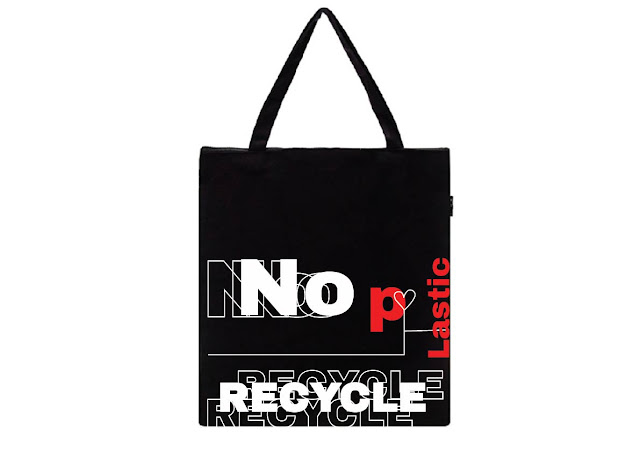
For this design there is a turtle eating a plastic bags, where turtles eat plastic bags for mistaking it as a jellyfish, which are their favorite food and many of them were harmed by it. Where below are the final outcomes for the final project.
However, after feedback I changed all the design by, reducing all those illustrations and use more text and typography to design the grocery bags, and below are my final outcomes for final project.
 |
| fig 1.9 Final outcome |
 |
| fig 1.10 Final outcome |
 |
| fig 1.10 Final outcome |
 |
| fig 1.11 Final outcome |
 |
| fig 1.12 Final outcome |
 |
| fig 1.13 Final outcome |
 |
| fig 1.14 Final outcome |
 |
| fig 1.15 Final outcome |
 |
| fig 1.16 Final outcome |
 |
| fig 1.17 Final outcome |
 |
| fig 1.18 Final outcome |
 |
| fig 1.19 Final outcome |
 |
| fig 1.20 Final outcome |
 |
| fig 1.21 Final outcome |
 |
| fig 1.22 Final outcome |
 |
| fig 1.23 Final outcome |
Feedback.
Week 11.
For my first idea to improve existing movie tickets, Mr. Vinod and Mr. Shamsul say, I must understand the machine that produce the tickets, because there is limitation of design it can print and also people these days just buy online and it might not be that effective if I design it. For the second idea of creating a design for Eco bag to use it instead of plastic bag , Mr. Vinod and Mr. Shamsul told me that I can do this for my final project, and must at least design 10 designs for this and print at least one as an Eco bag.
Week 12.
There was no feedback for week 12.
Week 13.
Mr. Shamsul told me that I have to reduce all those illustrations and focus more on designing it typographically and should put the design on real bag and should choose a more appropriate color for it.
Findings.
Experience.
Week 11.
For week 11, I research for what I can do for my final project ideas, and look around my surroundings for ideas and inspirations and what I can do to improve or experiment for within my interest using typography.
Week 12.
For week 12,I continued making more design for final project and search and look for more inspirations, that I can refer to, using Pinterest and other websites and look through how the bags were designed and search for global warming posters too.
Week 13.
Observation.
Week 11.
I saw what kind of ideas others thought of, and find out that some mostly think on how to improve typography of things around us. Also, I was able to find some good examples on how the other marts sell grocery bags and the design of it.
Week 12.
As I continue doing my work, I also look around how the others are doing their final assignment and did more research for more ideas in Pinterest.
Findings.
Week 11.
I was able to find some good examples, on many websites like Pinterest and was able to get inspirations from them.Also, I search online to buy a plain grocery bag to print my design onto it.
Week 12.
I search for more examples and design of grocery bag online like Pinterest and online shops that sell grocery bag for more ideas and inspirations.
Further Readings.


Comments
Post a Comment