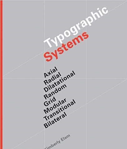
Advanced Typography Exercises
Advanced Typography.
Kim Chan Hee (0334532)
Bachelor of Design(Honours) in Creative Media
Advanced Typography Exercises.
For week 1, Mr. Vinod and Mr. Shamsul brief us about what we are gonna do for this semester and in advanced typography and told us to divide into four groups and do the lecture in front by ourselves after studying each two parts of the typographical systems, consisting of axial&radial systems, grid&modular, transitional&bilateral and dilatational &random. Where my group presented about the typographical system dilatational and random.
Above are all the google slides done by each group for the presentation.
Week 2.
No lecture for week 2.
Week 3.
No lecture for week 3.
Week 4.
No lecture for week 4.
Instructions.
For our first exercise we were to give a lecture to the class divided into groups, where I was in group 2 , members consisting of Vun Wan Min, Quaezie Ramlan, Farah Syahira, Arissa Alyaa, Christine Chia, Poh Min Ting. Since, our topics were dilatational and random typographical systems, we divided into two groups to take charge in each topic. Where my part for the presentation was to do the introduction for the topic 'Dilatational'.Below are the google slides created by our group for the presentation.
Introduction for the Dilatational typographical system.
. Dilatational systems are all the texts set along the circular paths, like the skin of an onion, one layer cover another layer, but all have the same center.
.Examples of this system include the iris of the eye, the rings of a tree trunk and sound waves.
.Similar to the radial system, the compositions are dynamic as the eye moves along the arc of the circle or is drawn to the focal point center of the circle.
.There are two ways to use the dilatational systems.
:First, people either use this system for smaller amount of texts to bring more interest for readers to read the information.
:Secondly, using it to build up some kind of texture and graphic on the background, creating beautiful pattern and movement.
.It can be best used for designers when they have to create a poster only using text, to give more visual effects to make it more interesting.
Week 2.
Exercise 1.
For our exercise one, we were given a task to create 2 layouts for each typographical systems , consisting of random, grid, dilatational, modular, bilateral, axial, radial and transitional, using In design.
Week 3.
Exercise 2.
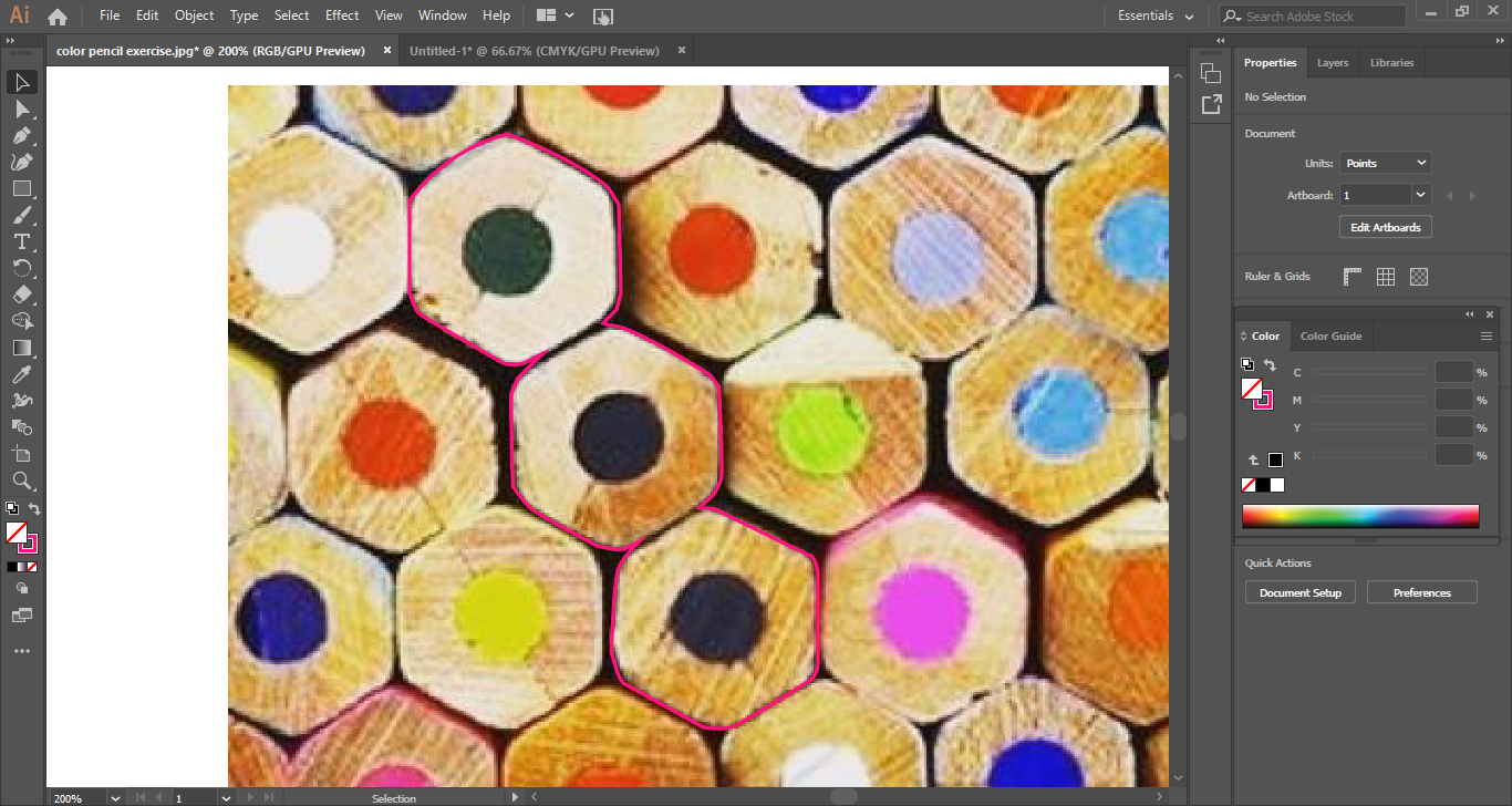
For our exercise 2, we were to create typography by tracing a picture of any elements, and find five alphabets within it, and create it into typography. Where I chose a picture of close up of color pencils for these exercises and created each alphabet by tracing it using the pen tool in Adobe Illustrator. Below are the process of tracing the picture.
This is the dissection of the picture to find an create an alphabet.
Below are the screen captures of the process of tracing each alphabet.
These are the final outcomes for exercise two, the alphabets I have done are 'C', 'I', 'V', 'X', 'O' and 'H'.
This is the alphabet 'C'.
This is the alphabet 'H'.
This is the alphabet 'I'.
This is the alphabet 'O'.
This is the alphabet 'V'.
This is the alphabet 'X'.
This is the final five alphabets that I have chosen.
Above is the comparison between the font 'Univers Lt Std 57 condensed' with those I have created.
After getting feedback, I did more refinement and made it look neater than before as, I thought all those shapes were not symmetrically correct.
For part two of exercise two, we were given a task to we were to create a combination of an image with any phrase or words, where we can search any images from different sites like Pinterest. Where I decided to use the word 'Fallen', for this exercise where I searched for images in the Pinterest and found the right image for it which is the one below.
I chose this image because it looks like a fallen angel from the sky and kind of have that gloomy, depressive feelings to it.
Whereat first I just placed the words, which I thought looked very plained so decided to give more effects by giving the words feather effects like they are made of feathers like the angel's wings, by using liquefy in Adobe Photoshop. Also added more feathers by adding black feathers, by making a custom brush in Adobe Illustrator.
There was no feedback since it was the first day of the class.
Week 2.
I was absent.
Week 3.
Mr. Vinod commented that the outcomes for exercise 2 are okay, but keep work on refining it and update on my blog.
Week 4.
There was no class commented.
Week 5.
Mr. Vinod and Mr. Shamsul commented that the typefaces are too black and should add more shades to it and that it should be arranged more to make it easier to read the letters, must increase readability.
Week 1.
I was very nervous, about doing a presentation as I have stage fright, but try my best to be as calm as possible and read through the topic, again and again, to understand clearly about it so I can explain and answer the questions based on the topic for the presentation.
Week 2.
I was absent.
Week 3.
It was actually hard to fins the right picture and was worried if I couldn't really able to find the alphabets within the picture.
Week 4.
I was not really sure what phrase to choose, and did research for more examples in p interest and other sites.
Week 1.
I kind of thought that it was a good idea to let the students do the lecture for each topic as it made us understand more about the topics and motivated us to learn more and do research.
Week 2.
I was absent for week 2.
Week 3.
I was fascinated with how the others did for exercise 2, saw lots of creative works.
Week 4.
As I saw how the others did for the typography poster with image,I was able to find some inspirations to refer to and was very interested on some of the creative works.
Week 1.
I was very motivated to understand and study the topics even though I was given a short time but managed to get the idea about the topic.
Week 2.
I was absent.
Week 3.
I thought that I must work hard on refining it with more research and reference from the others.
Week 4.
I was able to find some phrases and images suitable for it and research more on tutorials on how to create more effects on the typography.
Dilatational systems are all the texts set along the circular paths, like the skin of an onion, one layer cover another layer, but all have the same center.Examples of this system include the iris of the eye, the rings of a tree trunk and sound waves.
Similar to the radial system, the compositions are dynamic as the eye moves along the arc of the circle or is drawn to the focal point center of the circle.There are two ways to use the dilatational systems.First, people either use this system for smaller amount of texts to bring more interest for readers to read the information.Secondly, using it to build up some kind of texture and graphic on the background, creating beautiful pattern and movement.It can be best used for designers when they have to create a poster only using text, to give more visual effects to make it more interesting.
Kim Chan Hee (0334532)
Bachelor of Design(Honours) in Creative Media
Advanced Typography Exercises.
Lecture notes.
Week 1(26 August 2019)For week 1, Mr. Vinod and Mr. Shamsul brief us about what we are gonna do for this semester and in advanced typography and told us to divide into four groups and do the lecture in front by ourselves after studying each two parts of the typographical systems, consisting of axial&radial systems, grid&modular, transitional&bilateral and dilatational &random. Where my group presented about the typographical system dilatational and random.
Above are all the google slides done by each group for the presentation.
Week 2.
No lecture for week 2.
Week 3.
No lecture for week 3.
Week 4.
No lecture for week 4.
Instructions.
Exercises.
Week 1.For our first exercise we were to give a lecture to the class divided into groups, where I was in group 2 , members consisting of Vun Wan Min, Quaezie Ramlan, Farah Syahira, Arissa Alyaa, Christine Chia, Poh Min Ting. Since, our topics were dilatational and random typographical systems, we divided into two groups to take charge in each topic. Where my part for the presentation was to do the introduction for the topic 'Dilatational'.Below are the google slides created by our group for the presentation.
Introduction for the Dilatational typographical system.
. Dilatational systems are all the texts set along the circular paths, like the skin of an onion, one layer cover another layer, but all have the same center.
.Examples of this system include the iris of the eye, the rings of a tree trunk and sound waves.
.Similar to the radial system, the compositions are dynamic as the eye moves along the arc of the circle or is drawn to the focal point center of the circle.
.There are two ways to use the dilatational systems.
:First, people either use this system for smaller amount of texts to bring more interest for readers to read the information.
:Secondly, using it to build up some kind of texture and graphic on the background, creating beautiful pattern and movement.
.It can be best used for designers when they have to create a poster only using text, to give more visual effects to make it more interesting.
Week 2.
Exercise 1.
For our exercise one, we were given a task to create 2 layouts for each typographical systems , consisting of random, grid, dilatational, modular, bilateral, axial, radial and transitional, using In design.
 |
| fig1.1 Axial |
 |
| fig1.2 Radial |
 |
| fig 1.3 Dilatational |
 |
| fig 1.4 Grid |
 |
| fig 1.5 Modular |
 |
| fig 1.6 Transitional |
 |
| fig 1.7 Bilateral |
 |
| fig 1.8 Random |
Week 3.
Exercise 2.
For our exercise 2, we were to create typography by tracing a picture of any elements, and find five alphabets within it, and create it into typography. Where I chose a picture of close up of color pencils for these exercises and created each alphabet by tracing it using the pen tool in Adobe Illustrator. Below are the process of tracing the picture.
 |
| 'Color Pencil image' fig 2.1 |
This is the dissection of the picture to find an create an alphabet.
 |
| Progress for exercise 2 fig 2.2 |
Below are the screen captures of the process of tracing each alphabet.
 |
| Progress for exercise 2 fig 2.3 |
 |
| Progress for exercise 2 fig 2.4 |
 |
| Progress for exercise 2 fig 2.5 |
 |
| Progress for exercise 2 fig 2.6 |
 |
| Progress for exercise 2 fig 2.7 |
 |
| Progress for exercise 2 fig 2.8 |
These are the final outcomes for exercise two, the alphabets I have done are 'C', 'I', 'V', 'X', 'O' and 'H'.
 |
| Exercise two fig 2.9 'C' |
This is the alphabet 'C'.
 |
| Exercise 2 fig 2.10 'H' |
 |
| Exercise 2 fig 2.11 'I' |
 |
| Exercise 2 fig 2.12 'O' |
 |
| Exercise 2 fig 2.13 'V' |
 |
| Exercise 2 fig 2.14 'X' |
 |
| Exercise 2 fig 2.15 'all the alphabets' |
This is the final five alphabets that I have chosen.
 |
| Exercise 2 fig 2.16 |
 |
| Exercise 2 fig 2.17 |
 |
| Exercise 2 fig 2.18 |
 |
| Exercise 2 fig 2.19 |
 |
| Exercise 2 fig 2.20 |
After getting feedback, I did more refinement and made it look neater than before as, I thought all those shapes were not symmetrically correct.
 |
| Exercise two refinement fig 2.21 |
 |
| Exercise two refinement fig 2.22 |
 |
| Exercise two refinement 'C' fig 2.23 |
 |
| Exercise two refinement 'H' fig 2.24 |
 |
| Exercise two refinement 'O' fig 2.25 |
 |
| Exercise two refinement 'V' fig 2.26 |
 |
| Exercise two refinement 'C' fig 2.27 |
Exercise two. (Part two) Type and Image.
For part two of exercise two, we were given a task to we were to create a combination of an image with any phrase or words, where we can search any images from different sites like Pinterest. Where I decided to use the word 'Fallen', for this exercise where I searched for images in the Pinterest and found the right image for it which is the one below.
 |
| fig 3.1 |
 |
| Type and Image 'Progress' fig 3.2 |
 |
| Type and Image 'N' fig 3.3 |
 |
| Type and Image 'F' fig 3.4 |
 |
| Type and Image 'A' fig 3.5 |
 |
| Type and Image 'L' fig 3.6 |
 |
| Type and Image 'E' fig 3.7 |
 |
| Type and Image 'L' fig 3.8 |
I chose this image because it looks like a fallen angel from the sky and kind of have that gloomy, depressive feelings to it.
Whereat first I just placed the words, which I thought looked very plained so decided to give more effects by giving the words feather effects like they are made of feathers like the angel's wings, by using liquefy in Adobe Photoshop. Also added more feathers by adding black feathers, by making a custom brush in Adobe Illustrator.
 |
| Type and Image final outcome fig 3.9 |
Feedback.
Week 1.There was no feedback since it was the first day of the class.
Week 2.
I was absent.
Week 3.
Mr. Vinod commented that the outcomes for exercise 2 are okay, but keep work on refining it and update on my blog.
Week 4.
There was no class commented.
Week 5.
Mr. Vinod and Mr. Shamsul commented that the typefaces are too black and should add more shades to it and that it should be arranged more to make it easier to read the letters, must increase readability.
Reflections.
Experience.
Week 1.
I was very nervous, about doing a presentation as I have stage fright, but try my best to be as calm as possible and read through the topic, again and again, to understand clearly about it so I can explain and answer the questions based on the topic for the presentation.
Week 2.
I was absent.
Week 3.
It was actually hard to fins the right picture and was worried if I couldn't really able to find the alphabets within the picture.
Week 4.
I was not really sure what phrase to choose, and did research for more examples in p interest and other sites.
Observations.
Week 1.
I kind of thought that it was a good idea to let the students do the lecture for each topic as it made us understand more about the topics and motivated us to learn more and do research.
Week 2.
I was absent for week 2.
Week 3.
I was fascinated with how the others did for exercise 2, saw lots of creative works.
Week 4.
As I saw how the others did for the typography poster with image,I was able to find some inspirations to refer to and was very interested on some of the creative works.
Findings.
Week 1.
I was very motivated to understand and study the topics even though I was given a short time but managed to get the idea about the topic.
Week 2.
I was absent.
Week 3.
I thought that I must work hard on refining it with more research and reference from the others.
Week 4.
I was able to find some phrases and images suitable for it and research more on tutorials on how to create more effects on the typography.
Further Reading.
Week 1.
Dilatational systems are all the texts set along the circular paths, like the skin of an onion, one layer cover another layer, but all have the same center.Examples of this system include the iris of the eye, the rings of a tree trunk and sound waves.
Similar to the radial system, the compositions are dynamic as the eye moves along the arc of the circle or is drawn to the focal point center of the circle.There are two ways to use the dilatational systems.First, people either use this system for smaller amount of texts to bring more interest for readers to read the information.Secondly, using it to build up some kind of texture and graphic on the background, creating beautiful pattern and movement.It can be best used for designers when they have to create a poster only using text, to give more visual effects to make it more interesting.


Comments
Post a Comment